Imagine the situation: You compose an awesome email. You put created a wonderful graphic. You have the texts proofread. You test deliverability. You click “Submit” and slap a high five.
In a few hours, you look at the results and find out… People are opening the email like crazy. Only those clicks may be more. Just 2%? Was it worth the trouble?
The desired consequence of email marketing is a click-through to the site and purchase. Often, while producing an email, we concentrate on the content and sort of neglect the most crucial part (Call To Action).
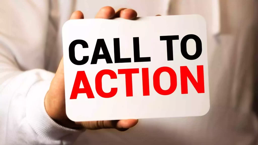
What is a “Call to Action,” and what makes it so important?
A Call To Action, often known as a CTA, is a request made to the user of a website to carry out a certain activity.
A command or action phrase is frequently used to convey a CALL TO ACTION. Such as “Sign Up,” “Add to Cart,” or “Buy Now.”
In email marketing, Calls to Activities generally take the shape of the text on a button (a CTA button) or a web link. Also, in email campaigns, CTAs are usually links to a web page where the user may conduct further actions.
Common CTA Examples
You’ve undoubtedly seen and clicked call-to-action buttons like the following:
- Sign up now
- Download your free ebook
- Request your demo now
- Download template now
- Learn more
- Schedule a free consultation
- Add to cart
- Add to wish list
- Buy now
- Follow us on Instagram
- Share on Twitter / LinkedIn / Facebook
As we have indicated, CTAs may also exist as hyperlinked text in action phrases, for example:
- Do you want to know more? Take a peek at this post!
- Have you ever tried “X”? Tell us in the comments.
- Are you interested in “Y”? Download the full ebook.
Importance of Call To Action
We have already discussed it at the beginning of this post: a successful Call To Action is a critical aspect of your Landing Page, and your sales funnel in general.
The user might not be aware of the next steps to take to make a purchase or sign up for an email subscription without a clear call to action, and it’s likely that they will leave the website without doing those actions.
- People are more inclined to do something when urged to do it. By making the step quick and apparent, you enhance the likelihood that they will continue through your sales funnel.
- A CTA may also inspire consumers to engage more with your website. By encouraging people to remain on your Page, you allow them to get more acquainted with your brand, which creates trust and opens the door for future transactions.
- A CTA button helps decrease friction while advancing the consumer through the sales funnel
There may also be several calls to action on a page if the user wishes to complete various activities.
The six characteristics of a good Call to Action
Good. We have previously examined the relevance of CTAs in your lead acquisition approach. But do you know what a good Call to Action should be?
A highly effective call-to-action button should contain the following:
- Good design: your CTA must attract the user’s attention.
- High Visibility – The call to action should be the most obvious feature on the Page. Thus, the font size should be large enough.
- Clear advantage — Declaring a benefit the user will obtain from completing the transaction is an excellent technique to convince them to click.
- Actionable Text – You should utilize action words like “discover“, “learn more“, and “buy now“.
5. Short Duration – A good Call to Action should not be a sentence but rather a brief phrase.
6. Feeling of urgency — Users are often sidetracked online, so a strong sense of urgency, such as a limited-time offer, may help them take action quickly.
Strategies to boost the CTR of your CTAs
Now that we know the idea on how to design a successful CTA, let’s examine the four techniques and their related approaches to get our buttons to have more clicks and, consequently, more conversion options:
1. Make your CTA difficult to overlook
If you’re aiming to develop the finest call-to-action button out there, you need to start by making sure your email readers notice it.
It will be of no value if you have everything else flawless if your users cannot locate it.
How to obtain it?
A. Make your CTA stand out on the Page
Since people have 8-second attention spans, your call-to-action button should be one of the first things your readers see when they open your email or visit your notification.
B. Use a color that helps your Call to Action stand out from the rest of the items on the Page.
As we have previously discussed, your CTA should stand out on the Page. And that does not only imply making this contrast with the rest of the components but positioning it in a location (or places) where the user can quickly discover it.
Placing your call to action on the first screenshot is typically a highly successful choice. However, it is not the only one.
Spot your Call to Action in a suitable place, and you will be raising its CTR:
Starting at the top left corner, a user generally looks twice at the Page horizontally, then glances (and/or scrolls) vertically to the left.
This recommends that you should include CTAs in headers, side panels, and at the bottom of the Page, article, post, etc.
C. Make sure it appears clickable
This is vital!:
- Use a bold outline or shadow and/or contrasting colors to create a clear definition of your CTA.
- Opt for a round or rectangular button.
- You may also utilize negative (blank) space to design your CTA. This works extremely nicely for mobile.
2. Make it tempting to click
Highlighting your call to action buttons is essential. But the most significant difference in your conversion rate will be the words you employ.
A. Try different copies
One of the most significant modifications in CTA testing happens while testing various versions.
Work out the sentences that you will put in your call to action buttons and test alternative combinations. The effect might be shocking.
Related reading: All you need to know about CTR
B. Focus on a brief message
Long, descriptive sentences that highlight why the user should click are not as successful as short, snappy remarks that go directly to the point.
According to studies, your Call to Action should include more than two words but fewer than 5.
C. Go to the user
Make your readers feel like they already possess the offer or product.
The best method to achieve this on your call-to-action button is to put up a first-person point of view.
So alter “his” and “our” to “me” and “my” to enhance your conversions
Also, explain to them the advantages they’ll obtain from completing the form, don’t urge them to submit it.
3. Encourage users
Take advantage of various psychological tactics that, applied to marketing, can help you raise your conversion rate:
A. Use “magic words.”
There are specific words that aim to urge prospects to continue down the funnel.
These “marketing words” (action, urgency, security…) have shown efficacy in raising the conversion rate.
B. Take advantage of “FOMO
You have to let your guests experience the pain of saying NO.
FOMO (fear of missing out) is a method that will help you boost the click-through rate of your CTAs enormously.
C. Create anticipation
Use narrative approaches to generate a touch of intrigue around your material.
With this, you will be able to attract the interest of your readers, who will not be able to resist following the button. They will have no option but to follow the thread to find the remainder of the tale.
4. Take advantage of the design of your Call to Action
It would be best if you depended on logical facts and research to lead the construction of your CTA.
The design team will handle the hands-on work and undoubtedly have some excellent ideas, but you have to make sure that the finished product accomplishes what it’s meant to do and merely looks lovely.
A. Customize depending on the device
Always test how your Call to Action button looks on various platforms (PC, mobile, tablet…) to ensure proper functionality on each of them.
B. Consider the design and size of your CTA
Your conversion rate will drop if your button seems more like a callout box than a button.
Also, please give it a decent size; don’t allow it to get buried in the rest of the Page because it’s not large enough.
C. Provide photos where they add value
Visual material draws attention and may also be beneficial to show the user what to anticipate in the next step or steer them towards the CTA.
Use graphics connected to your service that assist in conjuring the sensation you wish to induce in the consumer.
D. Explore with colors
As we have discussed previously, use a color that sticks out for your CTA button. However, this doesn’t always imply you have to opt for a vivid red.
So what color to choose? One that is enticing to your prospective consumers.
The only way to achieve this for sure is via A/B testing.
There is data demonstrating that solid colors are successful for CTAs, so you may start experimenting with colorful colours to discover which one best matches your brand and audience.
Bonus: don’t forget to test your Calls to Action!
Each audience reacts differently to diverse calls to action. There is no assurance that one Call to Action will outperform another.
As we have been discussing throughout the essay, in order to assess the efficiency of different CTAs on your website, you must run A/B testing of them. This will take remove any guessing and offer you valuable and objective information to enhance your CTAs and, thus, your conversion.
Regardless of the purpose of your organization or your industry, establishing a great Call to Action is vital for the success of your plan.
Conclusion
A call to action is a simple but extremely important part of every email you send. Pay proper attention to it; you’ll increase click-throughs and overall email marketing results.
Of course, every company approaches email differently. But it certainly doesn’t hurt anyone to think about the outcome they want for the recipients. And he will look for ways to push them toward that result.


